
DVS Weekly 43: Rotation Starts Here

Silver, REEs, and a Quick Reality Check
The last two to three weeks have been pivotal.
For paid subscribers; you’ll know I’ve been forecasting the silver setup for a while now. Just to clarify: I’m a big silver bull. Always have been.
If you’ve ever held a physical silver coin in your hand, you know there’s something magical about it. I’ve been investing in silver for nearly two decades, and I’ll admit; it’s addictive. I love the metal. I love the history. I love the tangibility. But at the same time, it’s hard to detach emotionally from it.
That said, the deeper I dive into (ratio) charts, the easier it becomes to stay objective. There’s a point where technicals speak louder than sentiment. When silver reached the 52–54 zone, I trimmed most of my silver and gold positions - publicly. Got some flak for it, even from within this community. That’s fine. We’re adults here. Markets reward discipline, not emotion.
Fast-forward to October 24, when writing this, and that thesis is still holding.
Below is REMX / SILJ; REE majors vs. silver juniors. It’s not a perfect apples-to-apples (REMX skews larger; SILJ is small-cap silver), and if I ran REMX / SIL (silver majors) you’d see the breakout even earlier. Either way, the message is the same: REEs are outperforming silver. That doesn’t mean it lasts forever, I’ll likely rotate back toward silver around $42 silver / SILJ ~17 (if we get it).
Either way, the message is the same: REEs are outperforming silver here.
That doesn’t mean this lasts forever; if anything, I’ll probably rotate back into silver around $42 silver / SILJ ~17 (if we get there… or perhaps even lower).
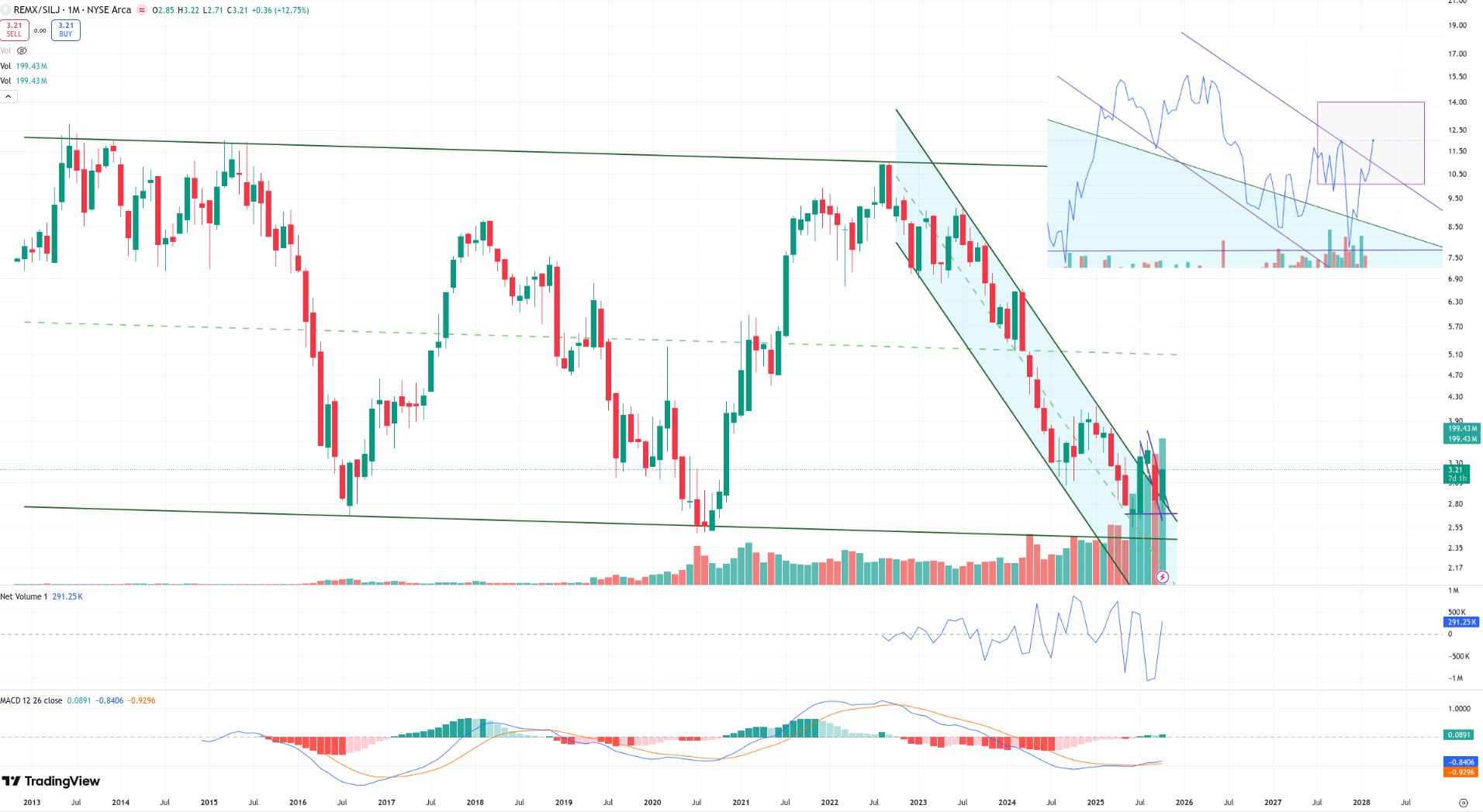
Two weeks ago, I shared the early structure of this breakout on X. Fast-forward to now - it looks even more confirmed. Still one week left in the month, so I’ll stay cautious until the monthly close, but the message is already pretty loud.
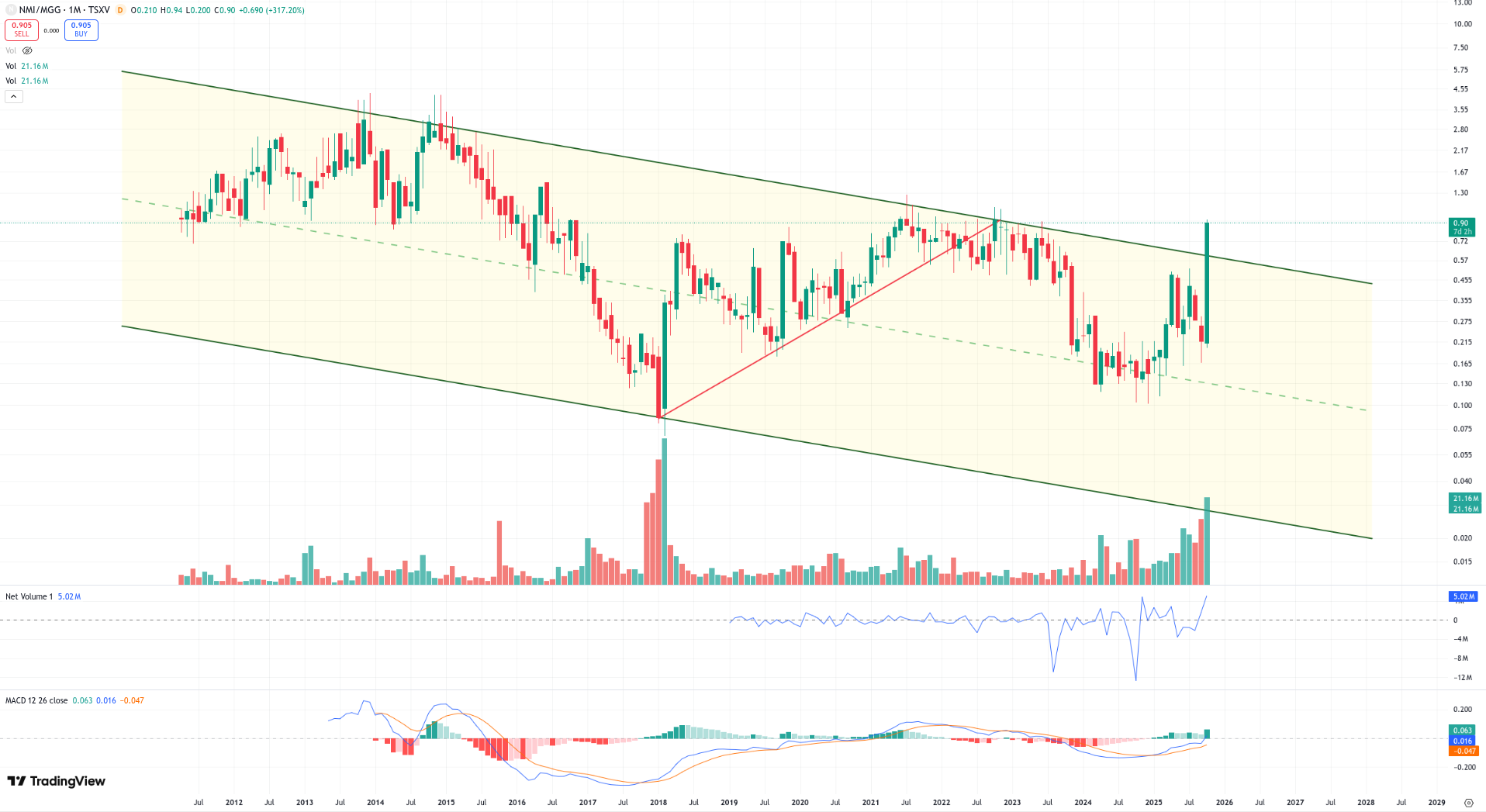
I also compared one of my top 5 REE holdings - Namibia Critical Metals (NMI) — against what @TheLastDegree called his #1 silver stock, Minaurum Gold (MGG).
The result? It broke out of a decade-long trend channel.
That’s not a one-off. I’ve run this comparison across multiple sectors, and the same pattern keeps emerging.
For those who think this is just me comparing REEs vs silver; it’s obviously broader than that. Yesterday on X, I ran a few more commodity comparisons, mainly coal-related setups, but also REMX vs the broader large-cap US energy sector. Some of the results were pretty eye-opening.
I also ran REMX against all the major commodity groups - e.g. gold, silver, copper, lithium - to see where the real strength is starting to build.
The REMX comparisons continue below in the paid section, where I’ve included a few fresh charts that haven’t been shared anywhere else yet. I think a couple of them might genuinely surprise you but more on that later.
Coal: Quick Rotation Note
It’s been a while since we’ve touched on coal, so I figured it’s time for a quick rotation update.
There are really two types of coal stories out there - thermal and met (coking). The first drives power generation; the second fuels steelmaking. Met coal remains the more attractive structural play long term; there’s simply no scalable substitute yet for blast furnaces but thermal coal names can still offer serious torque when the market gets it wrong.
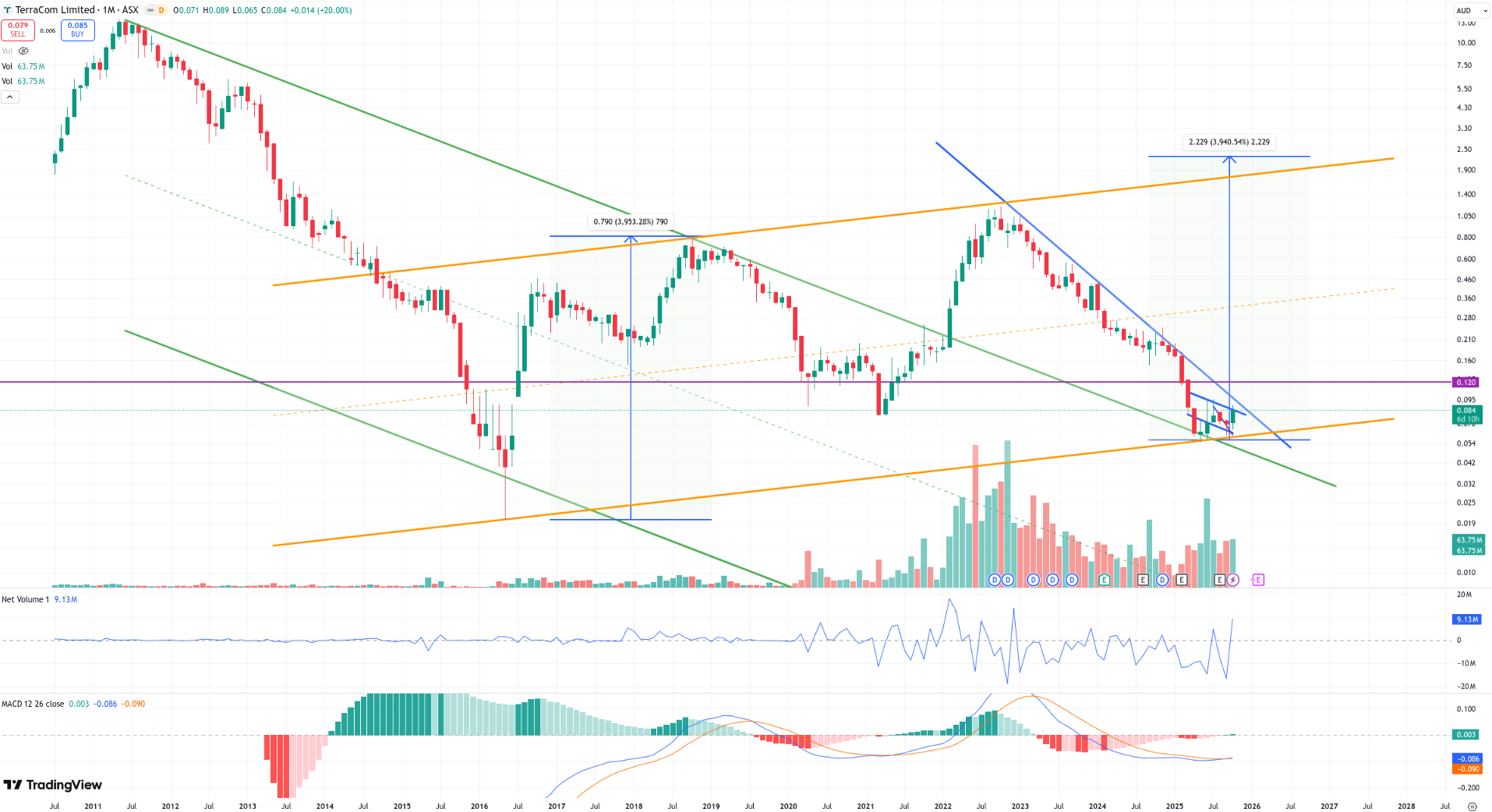
Terracom (TER.AX) falls in that thermal camp. It’s not the favorite from a thematic standpoint, but in terms of valuation and cash generation, it’s still wildly underappreciated. The stock continues to trade at a deep discount to what its balance sheet and cash flow justify.
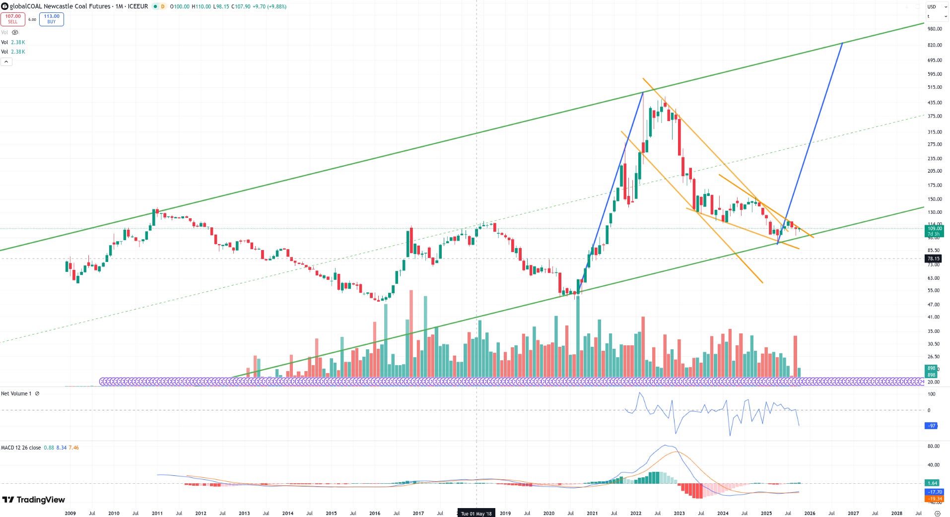
As you can see from the two charts below; the first one being Terracom, the second showing globalCOAL Newcastle Coal Futures (thermal) - both tell a similar story.
The first chart shows a textbook descending wedge coming right into long-term support. Volume has dried up, momentum indicators are starting to flatten, and the next structural move could be substantial if that wedge resolves to the upside. The risk/reward at this level is clean; limited downside, high torque if sentiment shifts.
The second chart, Newcastle Coal (thermal benchmark), captures the same broader pattern on a macro scale. Coal has been basing along a multi-decade rising channel, retesting the same lower trendline that produced every major cycle since 2009. Technically, it’s sitting right where previous multi-year rallies began.
In other words, both charts are showing the same underlying signal: coal may be deeply out of favor, but structurally, it’s not broken. When price compresses this cleanly at support across multiple timeframes, it usually means one thing: the next move could be sharp.
We’ve got four names in this space, Terracom being one of them. That one I share publicly, but the others - mostly met coal names - are covered in the paid section below. Those are the ones I’d generally prefer to hold long term, but I still like Terracom here simply because it’s so undervalued.
Coming Up in the Paid Section
Here’s what’s lined up:
I also had a recent call with the CEO of a company I really like, and I’ll probably share that interview publicly later this week. It only reinforced my conviction in the story; clean fundamentals, steady execution, and a valuation that still defies logic.
Continuation on the coal theme; insights on all four names, plus a deeper dive into the met coal setups that are showing early rotation signs.
Chart vs. News; a short piece expanding on why price leads headlines, not the other way around (inspired by Avi Gilburt’s framework).
A new Core 15 speculative pick; we’re doing a small swap here.
A few fresh ratio updates and comparisons; including some that might surprise you.
And of course, the usual news recaps, updated charts, and a few minor tweaks across the broader watchlist.
More on all that below.